Art Build DevLog Summary
The journey from my initial prototype to the current art build has been a process of refinement and focused iteration. The playtesting sessions revealed crucial insights that directly shaped the visual and experiential direction of Majority Rule.
The most valuable feedback from my prototype phase centered on simplification and clarity. Testers found the original single-screen approach overwhelming, with voting elements competing for attention alongside the core gameplay table. This led to my pivotal decision to implement separate, dedicated screens for each major game state. The voting process now occurs on a clean, focused overlay screen that eliminates visual clutter and directs player attention to the decision at hand.
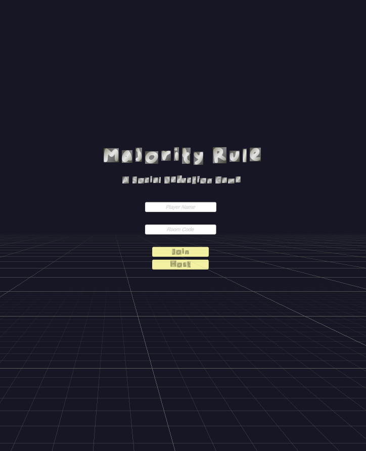
My clean lobby interface
I've strategically downscaled my feature set while maintaining the core experience. The original vision included complex moderator powers like vote weighting and player silencing, but playtesting revealed these added cognitive load without proportional enjoyment value. My current iteration focuses on the essential loop: rule proposals, voting, and strike-based elimination. This refined scope is allowing me to polish the fundamental social deduction experience while creating a solid foundation for future expansion.
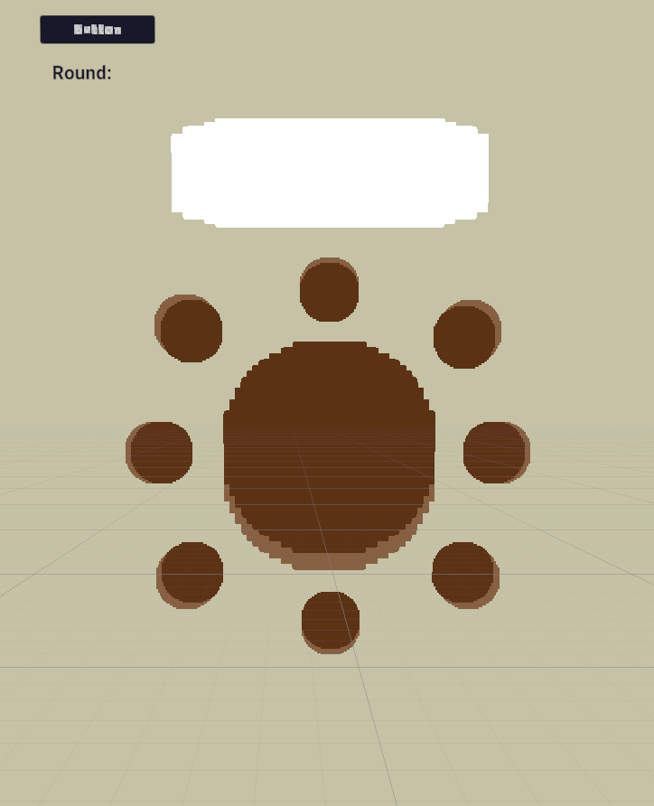
The round table design creates an intimate social atmosphere while clearly displaying game state through seat indicators.
The minimalist, bubbly aesthetic serves multiple purposes in enhancing the core experience. The pixel-inspired art style keeps the focus on gameplay interactions rather than visual complexity, while the rounded typography and clean layouts create an approachable party game atmosphere. Most importantly, the visual design serves the code. Each UI element clearly communicates game state changes, player status, and available actions without overwhelming the player. The text, however, outside of the button refused to appear in my game editor which honestly makes the above image look lackluster compared to the actual product.
My toolchain of Unity 3D and Visual Studio Code represents a deliberate choice to prioritize development efficiency and cross-platform compatibility. Unity's robust UI system enables rapid iteration of screen layouts and responsive design, while Visual Studio Code provides the clean, efficient coding environment needed for managing the complex game state logic. This combination has proven ideal for maintaining my focus on creating a smooth, functional experience across both mobile and desktop platforms.
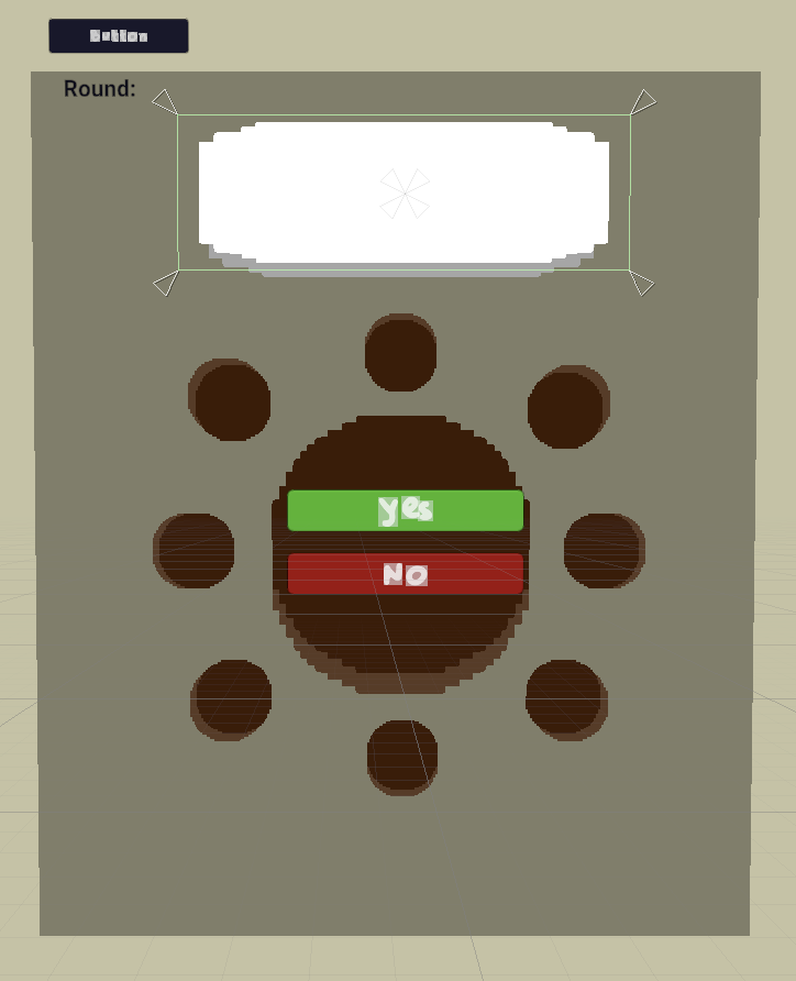
The dedicated voting screen emerged as a solution to prototype feedback about visual overcrowding.
The primary challenge emerged from screen real estate management. My initial prototype attempted to fit all game elements into a single view, which created significant usability issues, particularly for mobile players. The solution (creating distinct screens for each major game state) resolved the clutter problem but introduced new complexity in state management and code architecture. This has extended my development timeline slightly but ultimately creates a much more polished user experience.
Moving Forward to Beta:
My plan addresses these challenges through modular screen development ensuring each screen is fully functional before integration. The game over and vote results screens will be prioritized in the beta build as they represent the final pieces of the core gameplay loop. The art foundation I've established provides a flexible framework that can accommodate the additional code complexity while maintaining visual consistency and usability across all platforms.
Leave a comment
Log in with itch.io to leave a comment.